
Tuesday, May 7, 2024
Monday, November 7, 2022

Monday, December 20, 2021


Saturday, March 27, 2021
Orange Crate Art
by John Orr
California’s Legacy
To be fair, California historians can hardly claim Currier and Ives lithographic prints as a significant part of their state’s Left Coast art legacy. During the latter half of the nineteenth century, Currier and Ives produced countless numbers of lithographic prints in its New York City headquarters on Spruce Street. Based largely on paintings and drawings purchased from well-known artists, Currier and Ives’s offered affordable images of everyday lives, historical events, landscapes, and political satire to hang on the walls of modest homes all over America. Nathaniel Currier and James Ives were not ashamed to describe their New York art factory as “the Grand Central Depot for Cheap and Popular Prints.”


Currier and Ives’ lithographic prints attracted nouveau riche collectors in mid-century San Francisco. Eventually it employed agents and artists to establish a presence there. Still, their images of Northern California experiences and landscapes usually had to be shipped to New York City for lithographic fabrication and coloration.
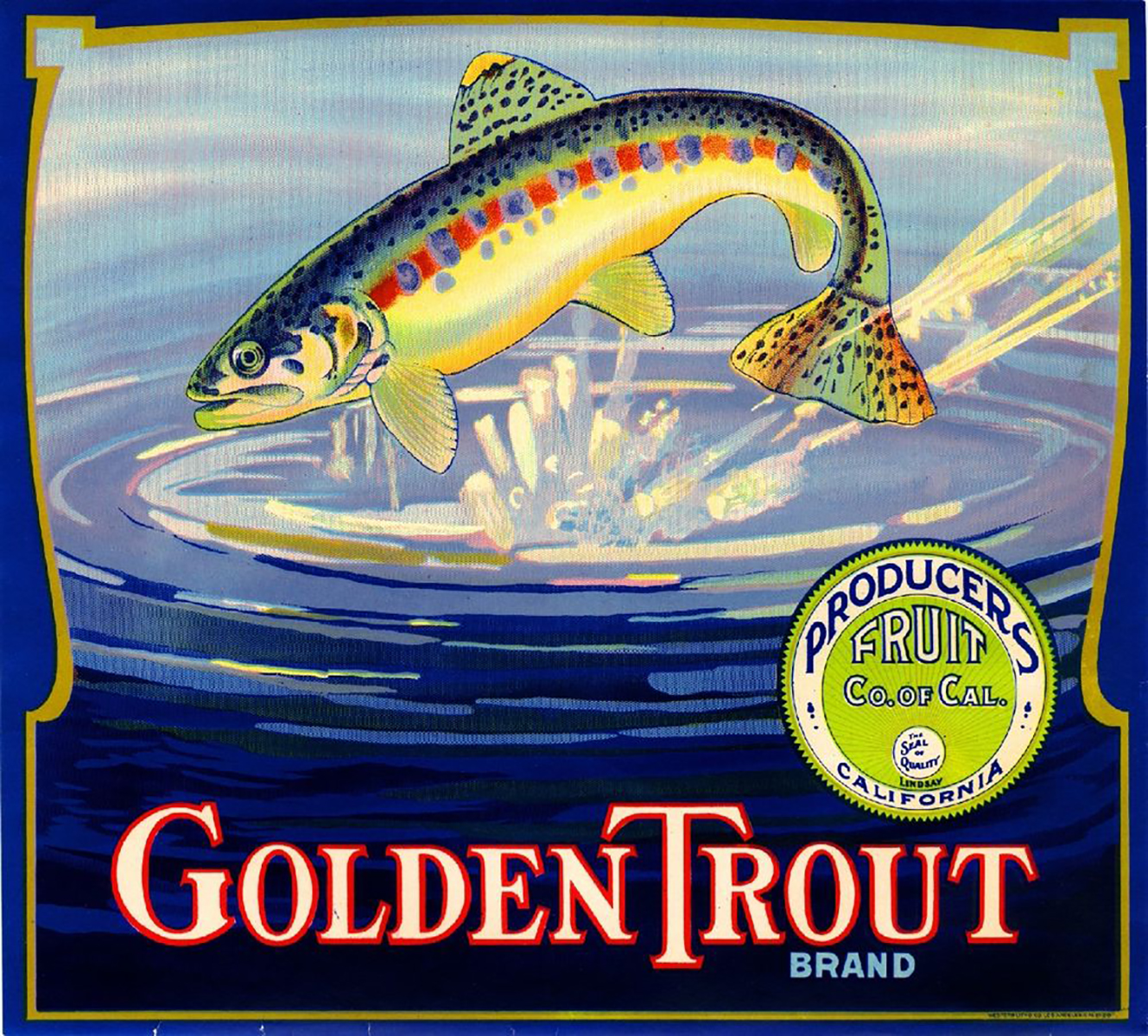
Max Schmidt, an immigrant printmaker who brought lithographic skills from Germany to his new home in San Francisco, established Schmidt Lithograph Company in 1872. It was easy for him to see that a niche could be created for a homegrown version of Currier and Ives. For a while, he sold cheap lithographic prints of Northern California scenes that were virtually indistinguishable from those produced in New York by Currier and Ives. He quickly recognized, however, that his newly adopted state offered another, more promising opportunity—the need for crate labels in California’s expanding agricultural industry, especially for orange crate labels.


The Union Pacific Railroad and other transcontinental railroad companies were expanding their use of refrigerated boxcars that could guarantee the arrival at distant locations of fresh, beautiful, health-promoting oranges. Likewise, the newly created California Fruit Growers Association was pouring advertising funds into the production of brochures, billboards, posters, and especially orange crate labels that promoted tourism and the consumption of California’s signature navel oranges.


Schmidt Lithography did not stand alone in its efforts to profit from the growth of California’s orange industry by printing orange crate labels. Multiple lithography companies with similar interests could be found in New York, Boston, Detroit, San Francisco, Los Angeles, Fresno, St. Louis and in other urban centers. Lithography companies routinely acquired other lithography companies. The names of these companies often changed, reflecting changes in ownership and geographical location.
Orange crate label producers relied on stone lithography (and, later, on mechanical innovations in lithographic printmaking) to produce thousands of branded orange crate labels. These labels were made for fruit grower associations and packing houses all over the state, especially in California’s San Joaquin Valley, Southern California, Ventura County, and Santa Barbara County. The labels were glued to the ends of wooden orange crates, placed in refrigerated boxcars, and shipped to distant cities.


Orange crate labels were never intended to be fine art. They were not printed to be hung on walls. They were a straightforward form of commercial art. Artists never signed them. But many of the labels had a character and quality that transcended their commercial function. Some, for example, displayed beautifully crafted, romanticized images of a California in-the-making, whose exotic landscape, history, and lifestyles could and should not be resisted. Some recorded historical events, e.g., the Depression, World War II, the development of airplanes, the opening of the Los Angeles Coliseum.
Some extolled oranges as spiritualized symbols of a human desire to live healthy, energized lives. Some utilized images that were associated with the immigrant origins of orange grove owners and packers. Many were simply odd, even playful, e.g., the image of a unicorn running across grasslands, with foam falling from its mouth.
But orange crate labels, like Currier and Ives prints, effectively functioned as “cheap and popular prints” in places far beyond orange industry sites. During the first half of the twentieth century, they were incorporated into a wide variety of everyday life settings. In my own Fillmore and Long Beach, California neighborhoods during the 1930s’ Depression, for example, people were using orange crates (with their affixed labels) as dining room chairs, toy boxes, storage containers, coffee tables, end tables, and bookshelves. In grocery stores, oranges were often sold directly out of crates that were still adorned by glued-on labels. Orange crates were laughingly regarded as college dormitory furniture.

I have recently discovered that elderly friends from various parts of the United States had similar experiences. They fondly and nostalgically remember the orange labels that graced their childhood and adolescent lives. They did not hang these labels on their walls. They sat on them.
They even lugged orange crates off to college, and some even carried them into early adulthood apartments. Orange crate labels were not regarded as collectible until World War II’s labor and resource shortages forced packing houses to turn to cardboard crates, and until orange groves were bulldozed in Southern California to make way for postwar housing tracts and industrial parks.
By the mid-1950s, California’s great lithographic printmaking companies were closing. Thousands of unused orange crate labels were consigned to storage boxes in packing house closets, waiting to be rediscovered by collectors in the 1960s and 1970s, by antique stores, and by entrepreneurs who encased labels in plastic table mats. A few archives were established in California museums and public libraries to preserve the labels for a later artistic assessment.

Irony abounds! Lithographically-produced orange crate labels were a commercial phenomenon, designed to bring money into the pockets of agricultural entrepreneurs. In contrast, the 1960s’ revival of lithography-based cheap art printmaking in Southern California began as an anti- establishment, feminist protest against barriers that made it difficult for women to function successfully in the Los Angeles’ art scene.
June Wayne, a Los Angeles artist, wanted to create an institution that would mentor aspiring female artists, and she concluded that the best way to do this would be to revive the use of lithography in the fine arts printmaking. Lithography did not require that expensive materials be used by starving female artists. A lithography-based printmaking revival promised to grow new markets for new artists through an expanded supply of affordable prints.

Using a grant from the Ford Foundation, Wayne opened Tamarind Lithography Workshop in 1960, and Tamarind’s success led to Los Angeles’ printmaking renaissance of the 1960s and 1970s. A network of printmaking lithography centers prospered in Los Angeles. Galleries that specialized in affordable prints (e.g., the Upstairs Gallery) thrived in low-rent areas of Southern California. Auctions of affordable fine arts prints multiplied as fund raising events for churches, schools and other nonprofits.
The new era of affordable fine art prints was supported by a period of radical social/cultural change in America. Sister Corita Kent at Hollywood’s Immaculate Heart College, for example, used silk screen “cheap art” techniques for her text-dominated posters (“Today is the first day of the rest of your life.”) During San Francisco’s Summer of Love, affordably produced, artistically significant posters advertised events at places like the Fillmore Theater. They subsequently were granted exhibit space in California galleries and museums.

Sadly, the historic ties of today’s fine art prints to Currier and Ives’ cheap art and to orange crate labels have not been sufficiently explored. Although the prices of art prints produced in the 1960s and 1970s continue to rise, the fruits of California’s emotionally powerful cheap art legacy still provide at least a modest restraint on the exclusion of middle class art collectors from the extremes of our currently inflated art market. Middle class art lovers should acknowledge their debt to cheap art predecessors, warts and all.

Saturday, November 9, 2019

Friday, May 17, 2019


Saturday, March 11, 2017
The Great Mosaic Wall of Zacatlán is finished!
Abstract: J. Manuel Aldana Zárate (translation,
Dick Davis)
The Murals of Zacatlán represent urban art including
beliefs, traditions and the identity of Zacatlán de las Manzanas,
Pueblo Mágico (Magic Town) in three murals in the perimeter wall of the
municipal pantheon starting with the commemoration of the 300th anniversary
since Zacatlán was named, "de las Manzanas" (of the apples). The
murals honor both the Nahuatl culture and beliefs and the biblical accounts of
the creation of the universe, and the birth, death and resurrection of Jesus.
The murals represent a religious, cultural and historic interpretation,
symbolic of urban-rural community and territorial identity.
The construction of this wall in the 19th century
served chronologically as a site for commercial, political and social
manifestations, and constructively evolved from being a stone retaining wall to
being a basis for contemporary artistic works.
The murals involved artists and volunteers working
together in cooperation with the municipality. It attracts tourism and
encourages economic development; it's an urban landmark that promotes public
policies that improve the image of the immediate neighborhood.
The
Murals of Zacatlan, public mosaic art on the walls of the municipal pantheon,
promote the transformation of the urban land use, modify lifestyle, create
value and establish environmental and social space where historical memories
materialize.
The
mosaic mural wall was completed November 2016. Below is an effort to convey the
entire wall, a project that took two years and covered 900 linear feet, and
individual photos of the 12 biblical panel scenes, which welcome visitors to
the pantheon.
 |
| Panoramic view of the 900 foot Zacatlán Mosaic Wall-01 |
 |
 |
| Artists, workers and volunteers |
Religious Sections of the Great Wall
 |
| The Creation - LA CREACIÓN Artists Erika Berra Simoni - Oswaldo Olvera Trejo |
 |
| Adam accepts apple from Eve - EL PARAISO Artists: Zefe Cruz Pérez - Miriam Barrios Martínez |
 |
| Annunciation - LA ANUNCIACIÓN DEL ÁNGEL Artists: Miguel Díaz Guerrero - Toñita Hernández |
 |
| Nativity, manger, Magi, shepherd - EL NACIMIENTO DE JESÚS Artists: Mary Carmen Olvera Trejo - Arq. Manuel Aldana Zarate Bernardino Villordo León - Juvenal Cruz Pérez |
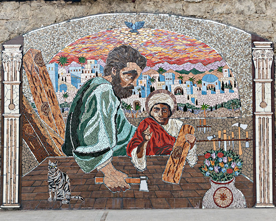 |
| Joseph teaching Jesus carpentry - JESÚS HIJO DE JOSÉ EL CARPINTERO Artists: Jorge Gutiérrez Ordóñez and Trish Metzner |
 |
| Resurrection of Lazarus - LA RESURRECCIÓN DE LÁZARO Artists: Luis Enrique “Güicho” Olvera Candelario - Raúl Sánchez Marchena |
 |
| Crucifixion - JESÚS EN LA CRUZ Artists: Mary Carmen Olvera Trejo - Arq. Manuel Aldana Zarate Bernardino Villordo León - Juvenal Cruz Perez |
 |
Holy Ghost descends on Jesus - RESURRECCIÓN DE JESÚS
Artists: Zefe Cruz Pérez - Miriam Barrios Martínez |
 |
| Mary Magdalene, first to find Jesus resurrected LA APARICIÓN DE JESÚS RESUCITADO A MARÍA MAGDALENA Artists: Jorge Gutiérrez Ordóñez - Trish Metzner - Oscar Sosa |
 |
| Jesus ascends to heaven - LA ASCENCÍON DE JESÚS Artists: Miguel Díaz Guerrero - Toñita Hernández Hernández |
 |
| Awaiting Judgment Day and bodily resurrection. LA RESURRECCIÓN DE LOS MUERTOS Artists: Erika Berra Simoni - Oswaldo Olvera Trejo |
 |
Gabriel blowing his trumpet announcing Judgement Day
EL ANGEL CUSTODIANDO A ZACATLÁN
Artists: Luis Enrique “Güicho” Olvera Candelario - Raúl Sánchez Marchena
|
 | |||
| Wings of the Angel - ALAS DE ÁNGEL, AUREOLA Y PEDACITO DE CIELO Artists: Miguel Díaz Guerrero - Toñita Hernández Hernández Inspiración: Mary Carmen Olvera Trejo Colaboración: Julio Cruz Nieto |
Subscribe to:
Posts (Atom)